In what ways does your media product
use, develop or challenge forms and conventions of real media products?
Music Video
For our music video, we took a lot of inspiration
from other band's videos, in both the same genre, and other areas outside of
the genre we were working in. We then utilized the elements which inspired us
to manipulate and convert them into ideas of our own which fitted our music
video.


The bands and artists which we looked into
were: Justin Bieber (Beauty and the
Beat), Green Day (Holiday), Yo Gotti (Look in the mirror), The Cardigans (My favourite game), All Time Low (Time Bomb), Fall Out Boy (I don't care), and another colleges past media video of E.G.O, Estelle (Do my thing).
The car journey from 'Green Day' was our main
inspiration for the narrative. We wanted to create an extra layer of meaning of
the song title 'Perfection' by creating an amplifying video of a road trip, in correspondence with Goodwin's framework, which did not just run on
the basis of a 'perfect' girl. , complying with the American Rock-pop genre we were working in. The narrative
in our video overall told a typical love story of a relationship between two
people, which was successful through the flashbacks of Matt and Lily together,
in shots such as on the park, showing the 'equilibrium' of the relationship. This is successful until
the relationship ends- amplified through the close-up of Matt putting his head in
his hands, which was the 'Disequilibrium, when things
started to go wrong. However, the car featuring videos we researched showed the
band just travelling with no real meaning (such as in Green day they drove through a
street), therefore we added an entropic twist by combining a love story with a road trip, amplifying the reconciliation of the couple through
the guy travelling back to the girls house. I feel our video does relate to Todorov's theory, who
states that narrative always involves a transformation. However our video
mainly shows the 'Recognition' and
'Reparation' through the road trip
in the car, with the equilibrium and disequilibrium shown through the short flashbacks, therefore the narrative is not in
chronological order and isn't as straight forward as Todorov theorizes. It also conforms to Goodwins framework of an incomplete narrative, and our narrative is distorted with the performance elements, making it easier for the
audience to watch. We tried to show a restricted narration, as it is all seen
from the perspective of the guy, with all his actions making his way towards
the girls house. We do not at all see any perspective from Lily's point of
view, and therefore we are restricting the view to just Matt's, making the
video more original and mysterious within the narrative outcome. We left the
end of the narrative as a cliffhanger as we wanted to follow the enigma resolution of Hollywood films (mystery and trying
to find out), as we wanted to leave the ending to the viewers imagination of
whether they got back together or not, and to encourage them to re-watch. Pam Cook suggests Hollywood
films are 'a high degree of narrative closure,' and since we did not just want to tell a story, but include the sense of
performance and a distorted narrative to ensure the views were entertained, we
went against the use of Hollywood genres, keeping the redundancy of music videos.
Another aspect from Green Day's 'Holiday' we were particularly interested in was the way the band members, sat on the sides of the car, looking like they were having a lot of fun, and not just sat on the seats in the car. We really wanted to be able to use this type of mise-en scene, to add to the excitement and pace of the video. We of course had to look at the safety hazards of this and make sure it was safe for the boys to do this. Once main difference we used for this car was we actually drove the car up and down a road, something which Green Day did not. This band used a green screen to film their car journey, and then added the street movement afterwards, which we thought did not look very professional, although we were not sure if it was supposed to look like that. We decided to use develop this convention away from the green-screen and create a video where the car is actually being used and driven, using lots of different close up and panning shots to make it as exciting as possible combined with the other locations involved for the narrative.
Another music video we looked at was: All Time Low's 'Time Bomb,'
Aspects which inspired us was the stereotypical band performance
movements, such as their body language and movement towards the mic, with the types of shot such as extreme close ups to portray this, connoting Goodwins 'Star image,' which we then tried to replicate
into our own bands performance and encouraged them to do so, prior to showing
them these shots. The star imagery is shown through mise-en scene, use of camera and
editing, to ensure the audience gets a full image of the band. We tried to
re-create some of the camera shots which All Time Low portrayed, such as the
close ups of the instruments alone and of the lead singer singing as well as the
other band members. Having used and utilized these elements for our own
performance, we have made it seem more redundant, having used the generic conventions of a performance element in the
video. We used many close ups and extreme close ups of each band member as well as mid-shots to go with the pace of the song
and enhance the performers personality. Furthermore we also used close ups of
the boys whilst in the car, to show the connection between the band and them in
the narrative and to develop the idea of the star image.
This star iconography has helped developed an image which makes them become
identifiable. This image was they all wore the same 'target audience and genre
orientated' costumes in both the narrative and performance which could connote
they are singing about their own experiences. The narrative and performance
came together at the end, with the long shot of the car approaching the house
and enhanced by the mid-shot of Matt looking up at the window as the song
finished, which is an entropic feature we used, as many videos we looked at kept the performance and
narrative separately.
Although we wanted to create an original and slightly different video to the ones we researched, it was important to keep many redundant factors which defined it as a music video. The main factor here was the lip-syncing, so it could be recognized as a music video and not just a distorted narrative of footage. We decided to twist and develop this further into our own idea to bring the present performing and the narrative together as the band approached the house but still keeping it visible as a music video.
Although we wanted to create an original and slightly different video to the ones we researched, it was important to keep many redundant factors which defined it as a music video. The main factor here was the lip-syncing, so it could be recognized as a music video and not just a distorted narrative of footage. We decided to twist and develop this further into our own idea to bring the present performing and the narrative together as the band approached the house but still keeping it visible as a music video.
Another influence for our music video came from the beginning of
'The Cardigans-My favourite game' This video incorporated lots of close
ups of elements of the car radio before the girl gets in, to establish
the older car in more interesting ways than just a mid-shot of it. We
thought it was important to introduce both the car, performers and the
flashbacks of Matt and Lily in a good and interesting way to entice the
audience. The main aspect at the beginning was about the performance and how
the band is playing the music, which we showed through lots of quick close ups.
Incorporated into these shots were quick edits of extreme close ups of the car which we used, such as of
the front lights, to show the audience that a car was to be involved later in the video to
help those who may not have had the cultural capital to understand the significance of the car if we did not introduce it
early enough. We did limit the type of shots we used to still close ups of the
car, because we still wanted the text to still be recognizable to the
audience. Steve Neale said ' Genre is instances of repetition and
difference;' therefore we incorporated the same level of close up car shots and
other conventions (close ups of band playing) we discovered and liked from all the videos we looked at (reptition), but in different ways to
show our own development. For example The cardigans used close ups of the girl
in the car just before they moved away, whereas we used close ups using hand
held shots in the car of the cast. (the difference).
The use of the older car in both Green Day and The Cardigans really
caught our attention, as it made both videos look authentic and more of an American style video. Our original
intention was to use an older car, which was going to be provided by
my neighbor who owns a green traditional convertible on
one basis: -It was dry enough to bring the car out of the garage. We looked at
the use of green-screen which we researched in both of these videos, as it was the main
convention for using a car for the majority of the video. We decided
against this idea, and were determined to make our video entropic by the use of
a real car (as mentioned before) breaking this intertextuality between these other
texts, as it would not be as clear to where we got our idea of driving the car from. We were on track
to using a conventional rock-pop style of an older car, until we were hit by
snow, which made it impossible to convince my neighbor to bring out his beloved
car. Luckily one person in my group had a modern Audi convertible and did not
mind the boys jumping into the car. Therefore using a modern car furthered the
idea of 'Entophy' as it is something you would not conventionally think of using with an
American styles rock-pop video, however we thought it worked really well and
the edits fitted the pace of the music.
Another influence we looked at was 'Beauty and the beat' by Justin
Bieber, which we were particularly interested in the use of the hand held shot
where it looked as if he was holding the camera himself. Although Bieber uses
this shot throughout the video, we liked the idea and to use it for a
fractional proportion of our video, showing our originality of adapting a technique to something
different. We used the shot at the start of the video when Matt says 'Hey
guys', which makes a direct contact to the audience, making it seem a more personal address. Justin Bieber
is part of the genre of pop, which is different to our mainly rock genre. Having said this, the technique fitted perfectly for the aspect we used it
for,and used it as Pastiche for our video beginning.. This could make our text Post-modern as we have shown elements of creating a Bricolage of ideas, which we have taken and
developed from different genres of music, including rock and pop independently
as well as our own ideas.
 We also wanted to portray a conventional DIY- Hand held shot, usually
used in fast flowing shots, such as in Green Day in the car and Bieber with how
he is 'holding' the camera himself. We used hand help to match the pace of the
song, in aspects such as footage of the boys in the car which is very shaky,
and when following the car from in front and behind,
the shaky footage adds an element of excitement which makes it more
interesting to watch. We also used these shots to keep the
video recognizable as this 'rock-pop' genre, which were
conventional of both rock and pop genres to
show excitability, although we developed the technique and used the
hand-held on elements of the performance. We did not want to
follow these conventions directly because otherwise
they would be too similar to the videos currently available, but at the same
time we wanted to develop them enough so the video was
still recognizable of a text from the genre that the audience would
understand.
We also wanted to portray a conventional DIY- Hand held shot, usually
used in fast flowing shots, such as in Green Day in the car and Bieber with how
he is 'holding' the camera himself. We used hand help to match the pace of the
song, in aspects such as footage of the boys in the car which is very shaky,
and when following the car from in front and behind,
the shaky footage adds an element of excitement which makes it more
interesting to watch. We also used these shots to keep the
video recognizable as this 'rock-pop' genre, which were
conventional of both rock and pop genres to
show excitability, although we developed the technique and used the
hand-held on elements of the performance. We did not want to
follow these conventions directly because otherwise
they would be too similar to the videos currently available, but at the same
time we wanted to develop them enough so the video was
still recognizable of a text from the genre that the audience would
understand.
Using too much entropy could be dangerous when creating a media product as it takes away any
anchorage which the text may have to make sense, therefore the audience has the
chance of not being able to understand or relate to it at all. It is
important to use elements of redundancy and easy recognizable features to ensure the audience
understands whats going on.
Other entropic features we used:

2. Slow Motion and
Reverse shots- We felt that these
would entice the audience more and fitted to the beat of our music. The slow
motion worked especially well on the note which was held for a longer period of
time, making it seem for realistic to put in an interesting slow motion of the
guys getting into the car as imagery to the audience.
3. Jump cuts: These were used to create an unpolished quirky look which we fitted to
the beat of the song to add more excitement and pace.
It was also important to use redundant factors in order to keep it
recognizable as a music video, some of these factors we used are:
1. Fast paced edits: Music videos are normally less than 4 or 5 minutes, so it is important
to keep the cuts quick and smooth, so it flows through the narrative and keeps
it understandable to the audience.
2. Short shots: Since the music
was fairly fast, we had to ensure that the shots and length of shots kept up
with the pace of the beat, and the use of different angled shots in a short
space of time helped to keep this pace throughout the video.
3. Cuts on beat: We noticed through our research that a lot of music videos edited to the
beat of the music. We wanted it to have a professional element, and to ensure
this we made our edits as close to the beat as we could, so it flowed through
the performance and narrative nicely without changing shots at random.
 Many of the videos we looked at outside had bright skies and were overall very bright, such as in sum 41's 'In too deep'. The brightness of the lighting and of the bright sky really added more energy and lifted the song to something which could lift your mood whilst watching it, and it was really inspiring. We really wanted to try and capture this brightness, with the lighting and the skies when filming to grasp the same excitement. We did not manage to get the same effect as we were hoping for when looking at these videos, and out lighting is very dark, not giving the same thrill and pleasure than it would be fantastic bright lighting.
Ancillary Products
It was important to research into existing adverts and digi-paks to give me the best
chance of creating successful ancillary products. To identify the common grounds and
conventions of these products, it was essential to
look into products which were of the similar 'rock-pop'
genre I was working in, in order for my product
to appeal to my audience.
The main digipak conventions I discovered were:
 1. The artist or bands
name was usually big and bold in a distinctive font, which was usually
part of their house style, which would be eye catching from the audiences point of view. The band
name and font usually carried into the advert showing they were coherent and part of a marketing package. I could not use the bands real house style text on my design. However I
created my own using a font from dafont.com, which I used throughout both my Advert and digipak simultaneously to ensure I kept them coherent to each other. I tested various different fonts from this site to see which fitted the
genre the most comfortably and which reflected the style f the song and the
style of the band, as well as it looking overall effective on the package. In
the end, I found that 'The quick monkey' looked the most effective as it was
eye catching and fitted the 'american rock-pop' theme of my audience. I used it for both the band name and album title as it was quite a decorative font, and I felt it would of drowned out and overwhelmed any other text I used, so I decided to use the same text throughout, however I used different sized font for the name and title.
1. The artist or bands
name was usually big and bold in a distinctive font, which was usually
part of their house style, which would be eye catching from the audiences point of view. The band
name and font usually carried into the advert showing they were coherent and part of a marketing package. I could not use the bands real house style text on my design. However I
created my own using a font from dafont.com, which I used throughout both my Advert and digipak simultaneously to ensure I kept them coherent to each other. I tested various different fonts from this site to see which fitted the
genre the most comfortably and which reflected the style f the song and the
style of the band, as well as it looking overall effective on the package. In
the end, I found that 'The quick monkey' looked the most effective as it was
eye catching and fitted the 'american rock-pop' theme of my audience. I used it for both the band name and album title as it was quite a decorative font, and I felt it would of drowned out and overwhelmed any other text I used, so I decided to use the same text throughout, however I used different sized font for the name and title. 2. The digipaks, such as Third Day and Evanescence had coherent colours and RGB curve
filters throughout, which is something I tried to follow so it
was recognizable to the audience. I used the same background which I
created on Photoshop using an eraser tool on a
filled background, throughout each panel and built up each one on top of this.
2. The digipaks, such as Third Day and Evanescence had coherent colours and RGB curve
filters throughout, which is something I tried to follow so it
was recognizable to the audience. I used the same background which I
created on Photoshop using an eraser tool on a
filled background, throughout each panel and built up each one on top of this. 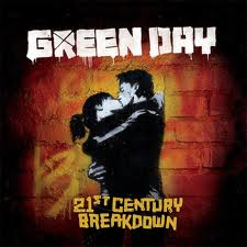 3. I also noticed that 'roc-pop' albums could be separated into two categories, photography and art work. I researched both
kinds, with evanescence and shows elements of photography, with Third Day using
photography on the inside cover. Green day however used a piece of artwork on
their front cover, which could of perhaps relate to one of their songs or the
album name '21st Century Breakdown.' It looked really creative and detailed- something which really related to the genre of music intended for. In the end I thought that the photography
looked more successful than 'the handmade' artwork effect and I felt that I had
a better chance of my digipak looking more professional by using photographs of
the band. I used Photoshop entirely to create my digipak with a Nikon DSLR to take the photographs. I did include one element of a 'homemade' art
work which was the moon used on both my digipak and advert
to symbolise the 'Late Nite' part of the bands name. I used Photoshop
to create this, using the circular shape tool and then the 'bend line' which
created the curve, just to add the edge of the music being for a slightly
younger audience, which built up part of my own house style.
3. I also noticed that 'roc-pop' albums could be separated into two categories, photography and art work. I researched both
kinds, with evanescence and shows elements of photography, with Third Day using
photography on the inside cover. Green day however used a piece of artwork on
their front cover, which could of perhaps relate to one of their songs or the
album name '21st Century Breakdown.' It looked really creative and detailed- something which really related to the genre of music intended for. In the end I thought that the photography
looked more successful than 'the handmade' artwork effect and I felt that I had
a better chance of my digipak looking more professional by using photographs of
the band. I used Photoshop entirely to create my digipak with a Nikon DSLR to take the photographs. I did include one element of a 'homemade' art
work which was the moon used on both my digipak and advert
to symbolise the 'Late Nite' part of the bands name. I used Photoshop
to create this, using the circular shape tool and then the 'bend line' which
created the curve, just to add the edge of the music being for a slightly
younger audience, which built up part of my own house style.4. I also noticed the redundant factor, that every album had a track list on the reverse, so the audience could see what tracks were on the CD, so I felt it was important to use this in my design. I used several tracks from 'Late Nite Readings' previous album and a couple of my own ideas which I felt fitted into the genre of 'Rock-pop.'

5. Furthermore each digipak either had a 6 panel or 4 panel layout. I found that the 6 panel worked best for the genre I was working in, and looked better, since Evanescence (4 panel) included a little booklet of artwork and imagery. I therefore went down the route of a 6-panel making each one unique, but still following my house style which I created.
When I started my research for magazine I noticed straight away that it had to be coherent to my digipak to show they are part of a multi-package. I flicked through magazines such as NME and Q , picking out 'alternate' band advertisements to understand the typical conventions of 'alternate adverts' (Rock-pop falls into this category). These were the conventions I found:
- The band text and/or logo which has been brought over from the digipak is featured showing the coherent element between the digipak and advert, which triggers the audience recognition between the two products, furthering their house style requirement. I used 'The quick monkey' on both my advert and digipak to help this recognition of the audience- if they saw the advert then went in the shops they would instantly be able to relate the album cover back to this advert.
- An image of the band/ Artist or an image which corresponds with the artwork used on the album cover. As a result I used three images (1 each of the boys jumping) which I had used on one of the panels for my digipak. They were not the direct digipak cover photos, so the recognition lay mainly with the text and the background and the face/ band identification. I also featured the 'homemade' moon I created to further the ideology of coherency.
- An itunes and amazon logo presenting that the album was available for download and sale. This was just used a method of advertising, and telling the audience where it could be purchased from and is available to download off the internet.
- The use of a Myspace website address, which gives the advert a more direct approach to the audience, allowing them to check out other music of theirs on this site.
Steve Neale said that 'Genre instances of repetition and difference.' I feel I have complied with this as I have used the repeated redundant features typically used for both the digipak and advert as well as developing my own ideas, such as layering features to suit the panels.
I found that my print productions were clearly more redundant than my music video, as the majority of the conventions i researched were needed in order to keep them recognisable as these media products. I used the redundant 6 panel layout for my digipak featuring 'parent advisory' (which I found were used on albums containing taboo language), bar-code, track listing, pictures and lyrics which are all redundant features expected. Similarly with my advert, I used many of my researched conventions to make it look like an advert published in a magazine, using redundant features such as images, bad artwork or photographs, the same coherent text used throughout both media products and download sites of the album.
No comments:
Post a Comment